Barvero - Wix
Barvero - Wix
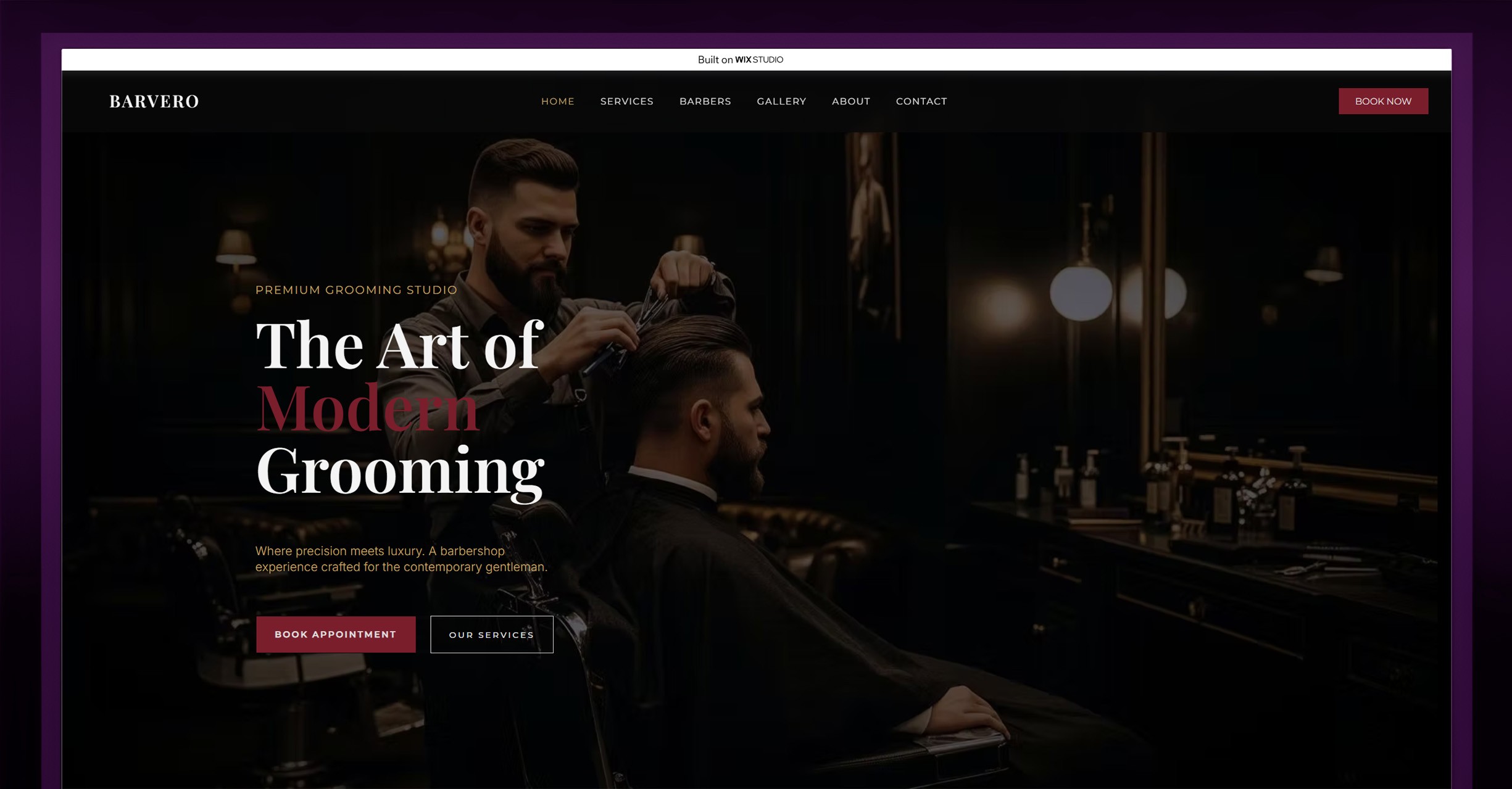
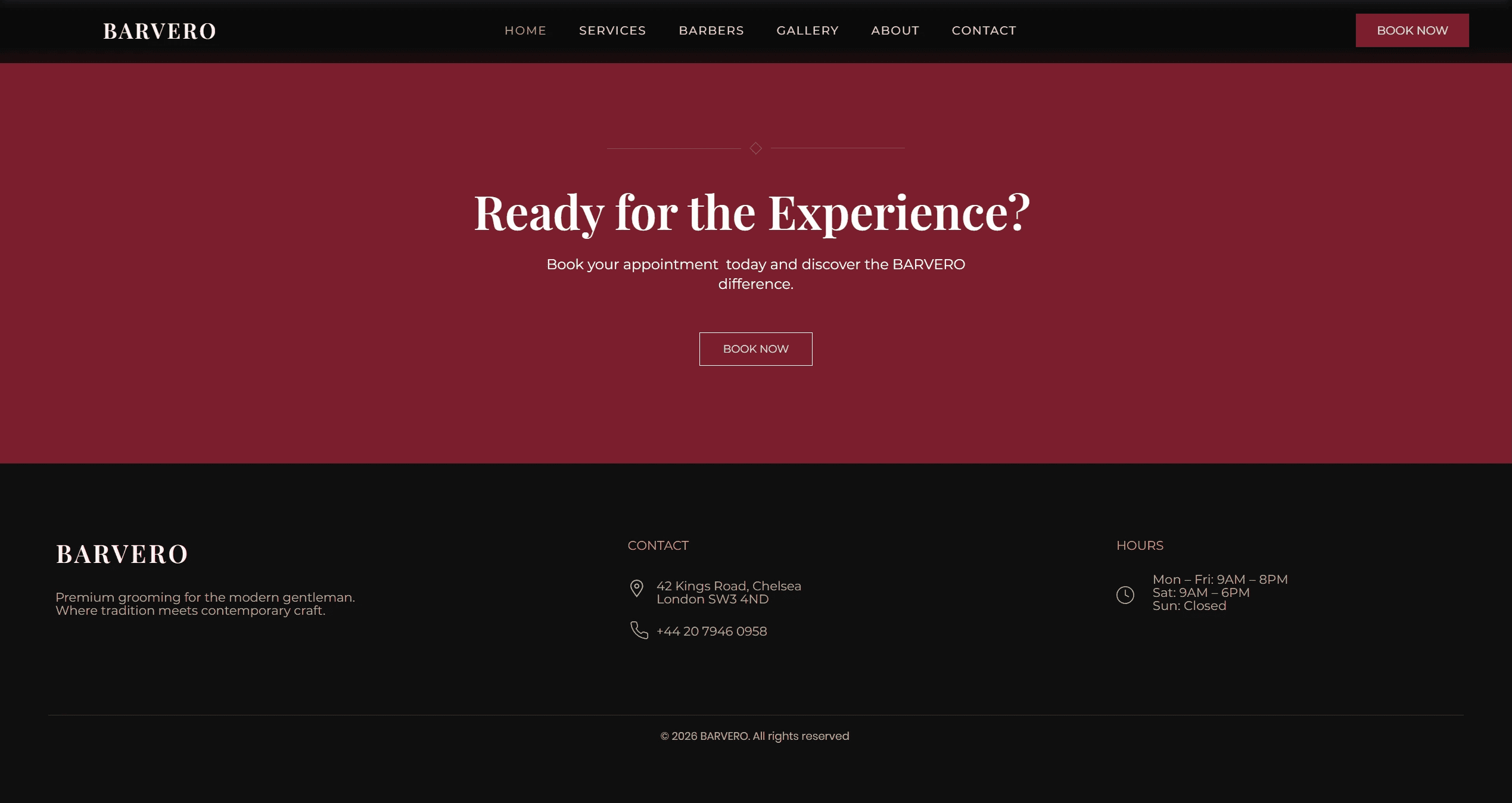
Barvero is a multi-page conceptual barbershop website built in Wix Studio with a strong focus on cinematic presentation, editorial typography, and premium brand perception. The project combines deep burgundy accents, monochrome foundations, and fashion-inspired layouts to reimagine the modern barbershop experience as something more refined and culture-driven.
Barvero is a multi-page conceptual barbershop website built in Wix Studio with a strong focus on cinematic presentation, editorial typography, and premium brand perception. The project combines deep burgundy accents, monochrome foundations, and fashion-inspired layouts to reimagine the modern barbershop experience as something more refined and culture-driven.
Barvero is a multi-page conceptual barbershop website built in Wix Studio with a strong focus on cinematic presentation, editorial typography, and premium brand perception. The project combines deep burgundy accents, monochrome foundations, and fashion-inspired layouts to reimagine the modern barbershop experience as something more refined and culture-driven.
Project Images:
Project Images:
Project for:
Project for:
Project for:
Barvero Barbershop
Barvero Barbershop
Barvero Barbershop
Barvero - Wix
Barvero - Wix
Barvero - Wix
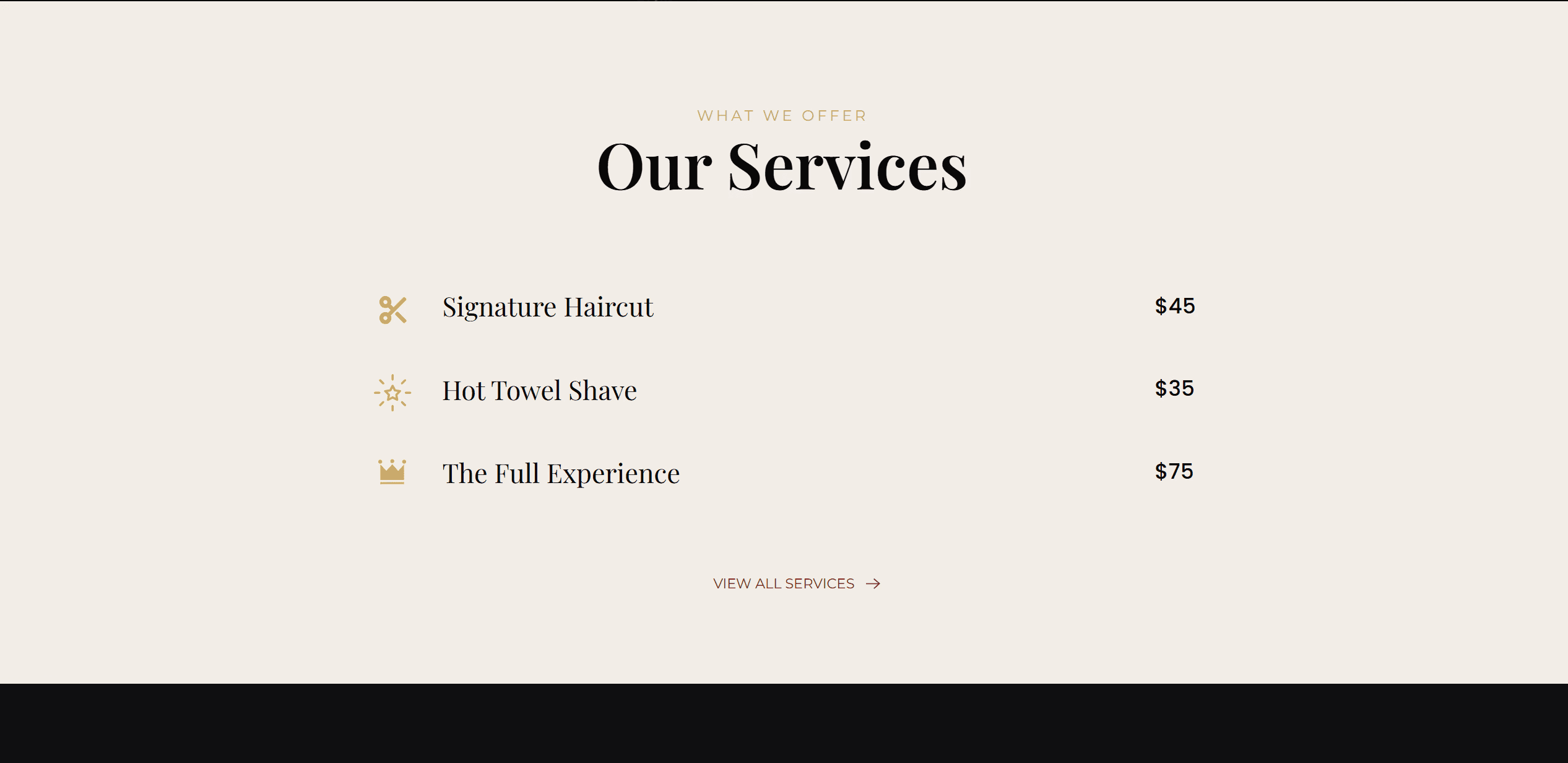
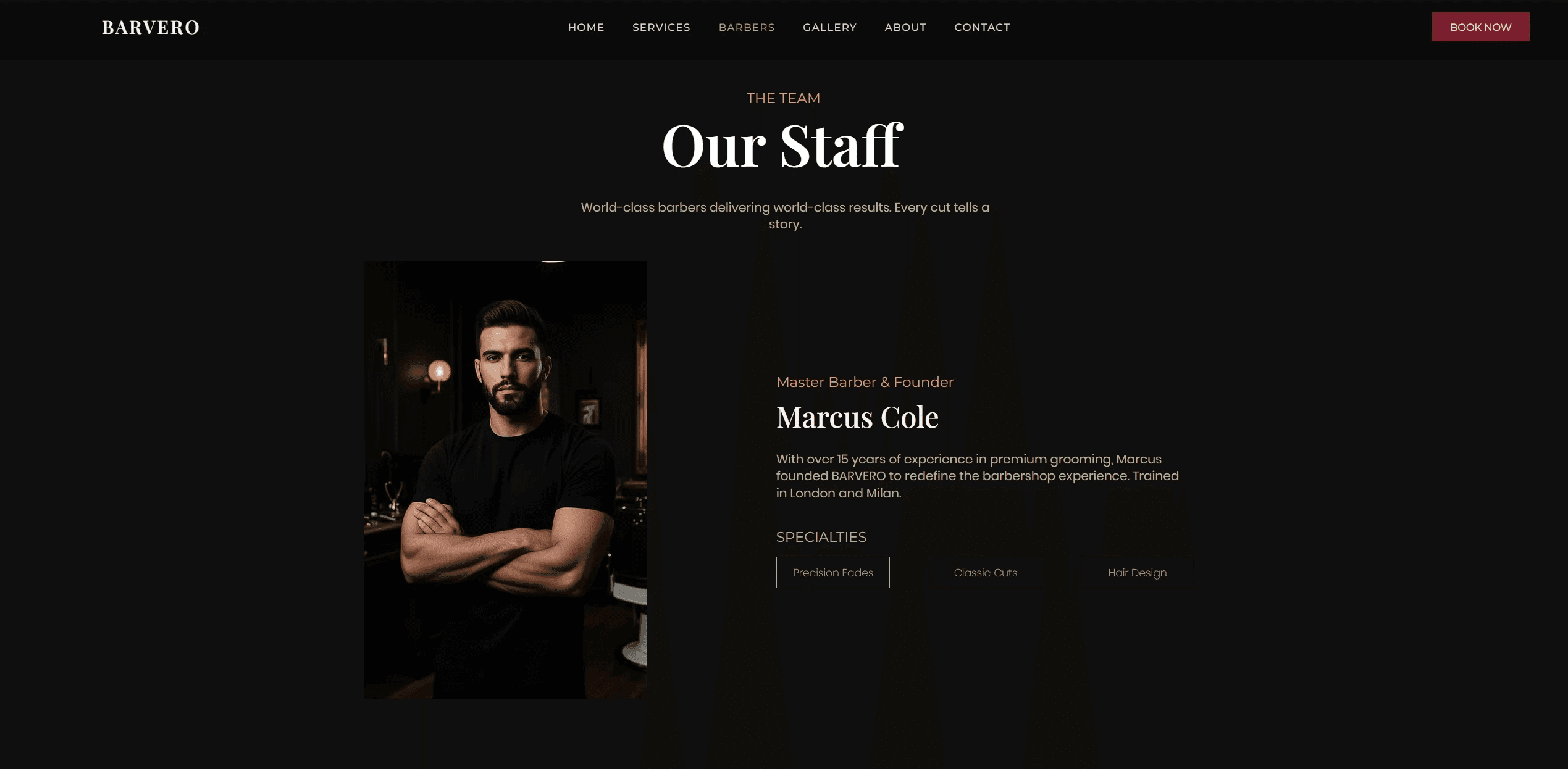
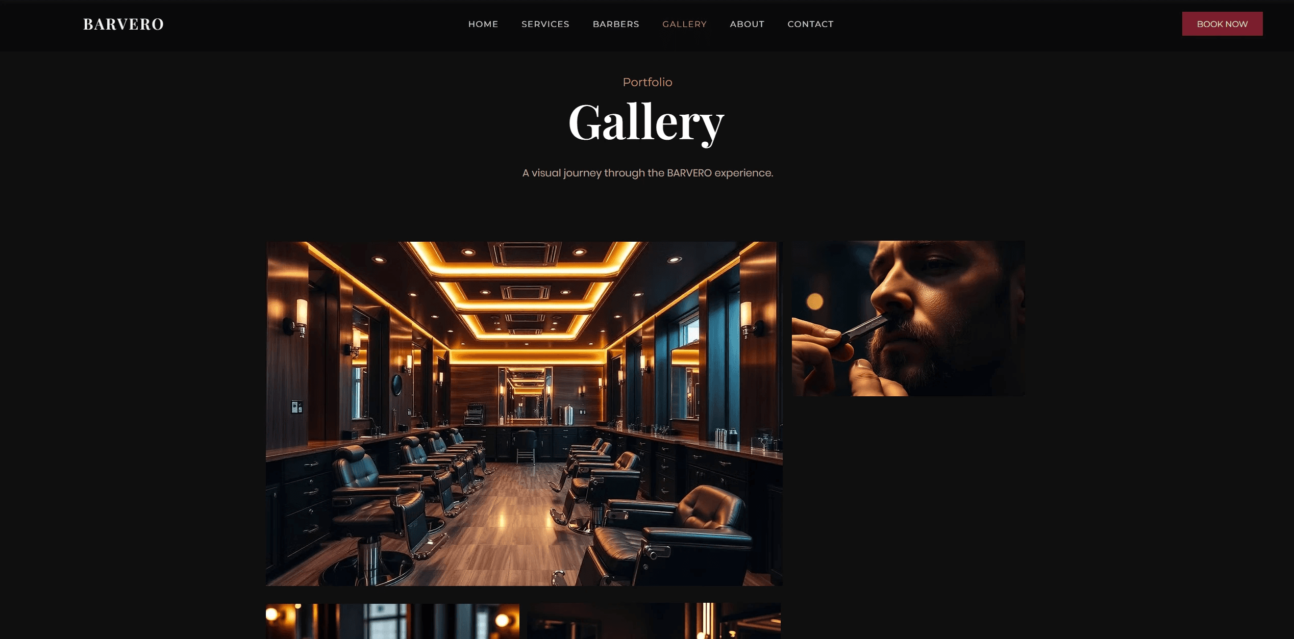
The homepage introduces the studio through large-format typography, atmospheric imagery, and asymmetrical compositions that guide the user through services, philosophy, and booking flow without relying on aggressive sales tactics. Additional pages expand the identity through service breakdowns, stylist profiles, a curated gallery system, and a minimal appointment experience.
A core part of the branding is the Barvero wordmark itself — designed to feel timeless, sharp, and slightly editorial. The burgundy palette symbolizes confidence, precision, and maturity, while the minimalist black-and-white foundation keeps the experience clean and masculine without becoming visually heavy.
The homepage introduces the studio through large-format typography, atmospheric imagery, and asymmetrical compositions that guide the user through services, philosophy, and booking flow without relying on aggressive sales tactics. Additional pages expand the identity through service breakdowns, stylist profiles, a curated gallery system, and a minimal appointment experience.
A core part of the branding is the Barvero wordmark itself — designed to feel timeless, sharp, and slightly editorial. The burgundy palette symbolizes confidence, precision, and maturity, while the minimalist black-and-white foundation keeps the experience clean and masculine without becoming visually heavy.
The homepage introduces the studio through large-format typography, atmospheric imagery, and asymmetrical compositions that guide the user through services, philosophy, and booking flow without relying on aggressive sales tactics. Additional pages expand the identity through service breakdowns, stylist profiles, a curated gallery system, and a minimal appointment experience.
A core part of the branding is the Barvero wordmark itself — designed to feel timeless, sharp, and slightly editorial. The burgundy palette symbolizes confidence, precision, and maturity, while the minimalist black-and-white foundation keeps the experience clean and masculine without becoming visually heavy.
Other Projects:
Currently available for freelance projects.
If you'd like to work together, feel free to reach out.
Currently available for freelance projects.
If you'd like to work together, feel free to reach out.
Currently available for freelance projects.
If you'd like to work together, feel free to reach out.